Dashing Young Lass
Punctuation worth ranting about

Maria Konnikova, famous for skunking the men’s world of poker champs—apparently, I don’t follow that world—writes a Substack newsletter. In a post just yesterday, she banged out a worthy defense of the humble em dash.
I once had a career banging on a computer keyboard, translating stuff from German into English. I wasn’t robbed of a livelihood by AI, though, but rather gave up the rather monastic lifestyle in favor of interacting with humans in person. Part of the job required me to copy edit and proof my own product before handing it over for final copy editing to whatever agency I was freelancing for on a given text.
This was where I also became acquainted with a lot of arcane punctuation and typesetting guidelines and rules of thumb. It was where I explored the details of hyphens, en dashes, and em dashes. Once you get familiar with that arcana, you tend not to forget it—rather unlike choosing the correct version of some devilish homophone…
Em dashes are a perfectly useful sign of an interruption in the flow of text, for clarification or digression perhaps. They so something similar to what comas do: set off appositives, parenthetical expressions, or just announce a digression. But em dashes do it with a bit more panache.
As a foretaste, Konnikova starts her essay—”In defense of the em-dash”—thusly:
All hail the em-dash, that double-hyphen that has far more than double a hyphen’s meaning. That beautiful punctuation mark that has punctuated writing for centuries—even as it comes under attack, time and time again. The latest threat: the notion that the literary darling of greats from Emily Dickinson to Benjamin Franklin is a sign of, yup, AI-generated writing. I’m calling BS.
The rest is here.
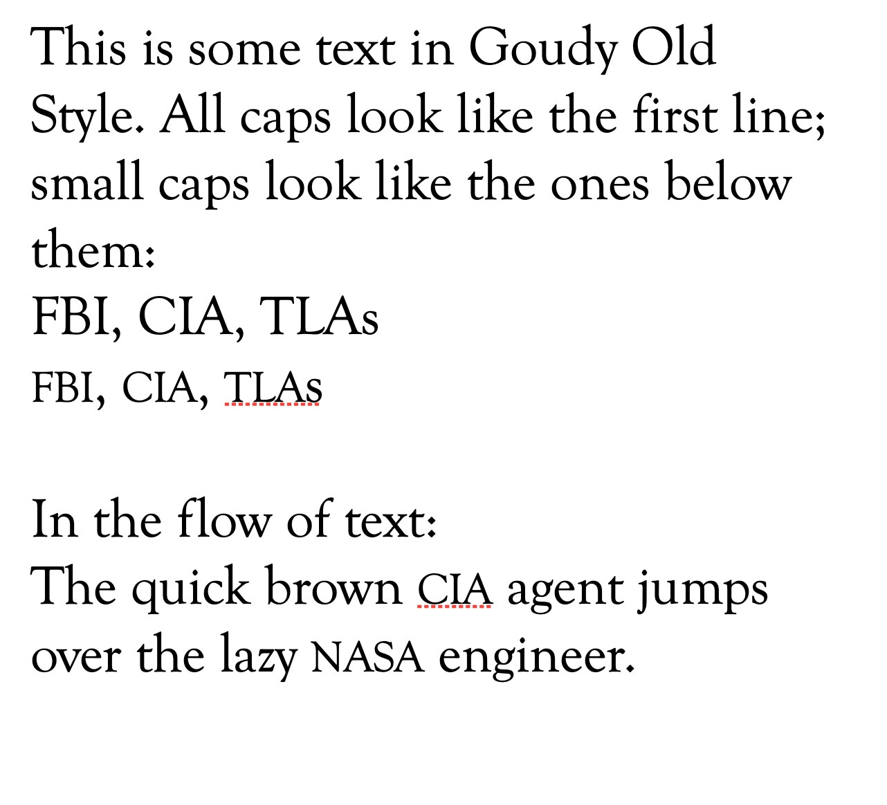
In my personal style guide of the mind, hyphens and en and em dashes should never be surrounded by spaces, but directly link the words together. That’s my aesthetic preference. Also, whole numbers from one to twenty should be written out as words, as should any number that begins a sentence; symbols like “%” or “&” or “$” should be written out as words, and, oh, a lot of other futzy details. I’d also harp on small caps for abbreviations, but the limitations of the Substack editor don’t offer that typographical option.
Here’s what small caps look like in a modern word processor:
Now, if someone would write a passionate rant-splainer about the humble ellipsis…
Good morning. I like to put spaces - only one space, not two - around em-dashes, which my keyboard does not support anyway, so mine just look like dashes.
Weathers here in Boring are warm, 59/73, and cloudy. I'm continuing to recover from the gripa: I now feel pretty normal except for occasional pauses to hack up phlegm. Sorry, TMI.
Husband and Teengirl will be camping with the Scouts this weekend. I'm going to the food warehouse this afternoon to sort potatoes into Thanksgiving boxes.
The Charlotte Observer is reporting a 4-car collision yesterday, not far from where Drama Queen lives, caused by a driver speeding the wrong way up a major street. The wrong-way guy died, other three (the ones trying to go the right way) reportedly were not injured, but one assumes the dead guy was uninsured, so they're in a world of hurt anyway.
The kicker: it happened at 11:30 a.m., that's 11:30 in the morning on a non-rainy day.